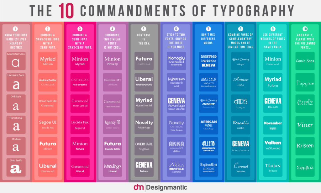
Typography is one of my favorite things to work on when developing brands. The right font combinations really bring the brand’s message to life. Whenever I consult with clients, I love reviewing the 10 Commandments of Typography by Designmantic. It’s just a high-level infographic of how to (and how not to) select fonts, but it’s a great baseline on how to choose complimentary styles if you’re just getting started. Knowing what serifs are and when to use them will make the difference between a great font pairing versus one that just doesn’t resonate with your particular reader in the way you need them to.
I usually gravitate towards 2 main fonts. A heading font and body font. Your heading font will mostly represent your titles and headlines while your body font represents your larger bodies of text.
When selecting your heading fonts, don’t be afraid to select something big and/or bold, especially when your brand represents that culture. You want to put emphasis on these fonts as they are often the fonts that invite your audience into clicking or reading through to your article. I often like choosing fonts that look great when capitalized and still have a balanced look with a bit more letter spacing. This style often works well with sans-serif fonts. Adding this type of negative space in your typeset helps achieve a cleaner effect that lets your design breathe. Of course, creative license goes a long way, and great designers find ways to make unconventional fonts look great. There’s no rule book when it comes to design.
Your body font should be easier to read over long periods of time. With bodies of text, you may want something to compliment your heading font but still look similar to how fonts are often chosen in an actual novel. They’re generally a more standard-looking font that is easy to read. Well-developed fonts usually have a light or “book” styling which often makes a font easier on the eyes when it comes to large bodies of text.
A tertiary font can also be used. I find a third font handy to break the monotony of text-heavy content, but I generally only implement 2 fonts in branding guidelines to start. If there isn’t any immediate need for one, this can be selected later.
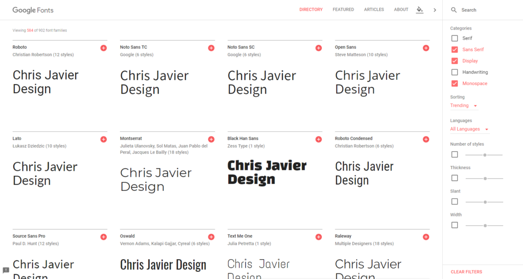
Overall, there are many different font styles that work. When selecting fonts, I start with Google’s catalog.
The main advantages to using Google Fonts:
- They’re free! You can easily download and install them on both desktop and web environments.
- They’re web ready and vectorized, so they scale seamlessly based on display size.
- If you use GSuite, Google fonts are already used in all of their products.
- They’re often installed on many web frameworks by default as well. (DIY Site builders, open-source word processors, WordPress, etc)
- They’re well developed, including various styles (Book, Light, Normal, Bold, Extra Bold, etc)
- Easy to implement in Adobe TypeKit
Google fonts might look a bit dull at first, but with clever styling in letter spacing, line height, color and font weight, you can create something beautiful in minutes.
Some great examples, and ready-to-use Google font combinations, can be found at FontPair.co and ReliablePSD.com. These resources come in handy if you want to get started quickly or if you just need a bit of inspiration to create something fresh and original.
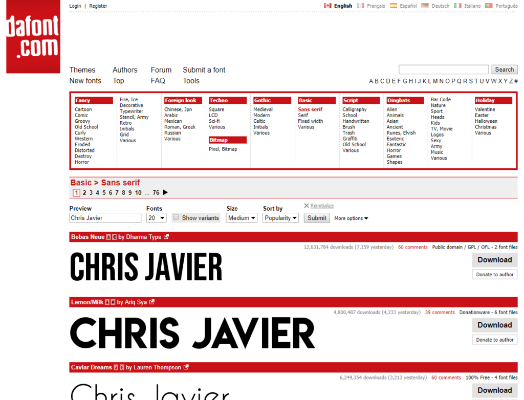
If the brand calls for something more stylistic beyond what Google offers, I look at fonts on sites such as Dafont.com. They’ve got a neat, little type-field allowing you to preview all their fonts in whatever words you choose (The Google Fonts website can do this, too!)
> Continue To Brand Design: Design Language
- The Amazing Gnome Race - May 14, 2021
- Vieja’s Versus - May 14, 2021
- Toronto Golf Lessons - May 5, 2021


