Amid the excitement of starting a business, folks often first think about their logo – their brand identity. In my humble opinion, it’s definitely the most important 😉, but should actually be one of the last to determine. Some people like to work backwards by starting with a logo and then basing their color scheme, font set and design language on it. I mean, that works… but the issue is that you are skipping essential aspects of your brand that could better shape and inspire a logo that could make a greater impact on your target audience. It’s better to flesh out all of those details first, especially if you want your logo to encompass your brand’s true vision.
Proportions
When designing a logo, pro designers understand how constraints and proportions play a role in making a logo look clean and eye-catching. Although it definitely isn’t a mandatory, utilizing the “golden ratio” is a great baseline to follow when considering your logo’s overall look and shape. The golden ratio places elements within a logo at the specified ratio of 1:1.618. It might sound tedious or confusing at first, but below you can find examples of corporate brands utilizing the golden ratio in their logo to provide a clean, psychological effect of precision or symmetry.
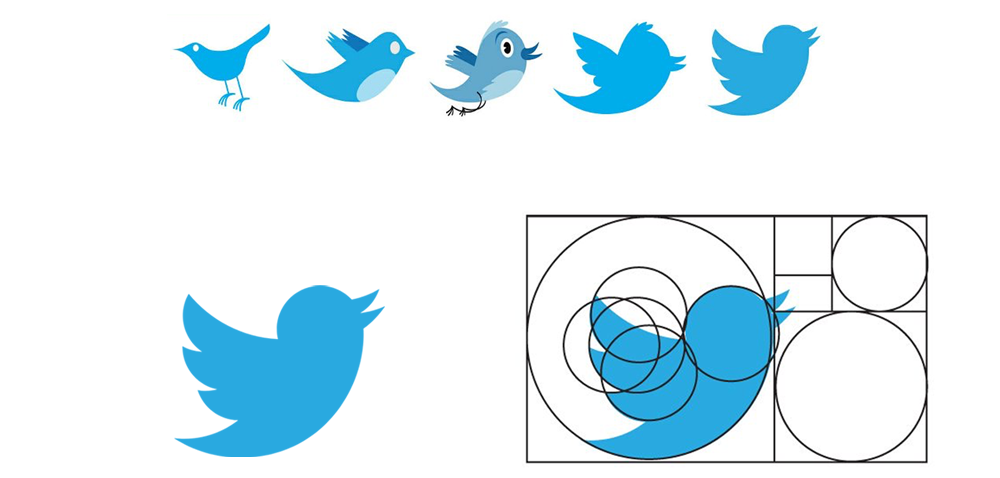
If you’re interested in learning more about the golden ratio, Canva has a great breakdown on how the golden ratio is used in logos.
When considering what your logo should be, whether it’s a person, place, thing or symbol, always think about how it would make your audience feel, and if it resonates with how you want to portray your brand. Of course, the quality of your logo boils down to how good your designer is. Make sure you select a designer that understands your vision as complete as possible and ensure their style matches the message you’d like to portray.
Mediums
Also, consider how and where your logo will be used. How would your logo look when it’s printed smaller on a business card? Is it legible? Is your logo too text-heavy? How about on mobile devices and websites? Are you an apparel company? How would your logo look on apparel using different knits and print methods? The medium is the message, so it’s best to ensure your logo is ready for prime-time on your most-used applications.
Often businesses like to create two versions of their logo. In essence, they’re the same logo, but different versions. Whether it’s different color variations to appear better on black or white, or short/long versions of the logo appropriate for the medium. For example, Pepsi has their full Pepsi logo that displays the full Pepsi name, but they also have a short version of their logo, which is just their round logo mark. Considering the different mediums your logo will be used on can help you determine how it would look best and whether you should implement color variations or short/long versions.
Logo Recognition
Lastly, is your logo memorable? How easy would it be for someone to remember your mark? Is your logo so “busy” that it hinders brand recognition? Here’s something fun to browse through that might inspire ideas on how to make your logo more memorable. Boredpanda released an article on “150+ People Tried To Draw 10 Famous Logos From Memory, And The Results Are Hilarious”
Goes to show how well logos program your audience and how often they’ll be able to quickly tune into your brand on a whim.
This brings our Brand Design Development crash course to an end but now, you have your work cut out for you! Now that you have a nice brand development road map, I’m hoping it instills some inspiration and helps you understand what it takes to design a kick-ass brand. Don’t hesitate to reach out if you have any questions or need any help on the way!

- The Amazing Gnome Race - May 14, 2021
- Vieja’s Versus - May 14, 2021
- Toronto Golf Lessons - May 5, 2021