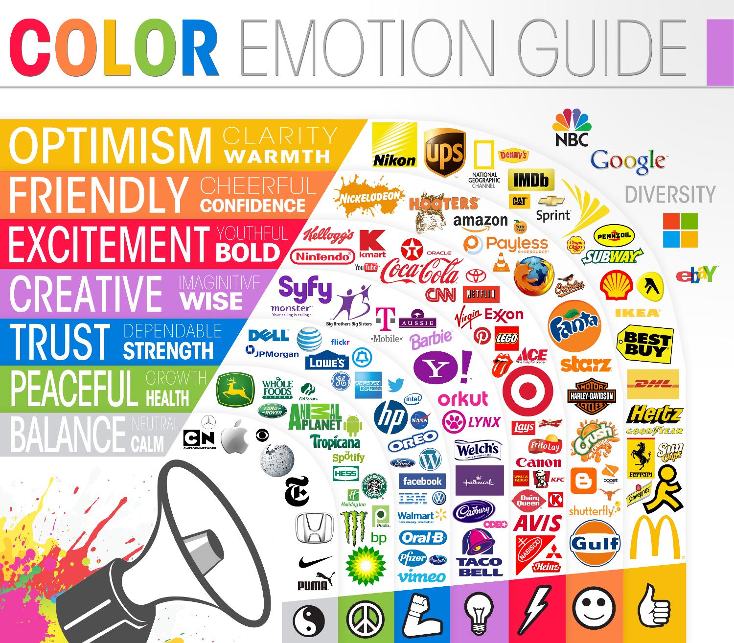
When it comes to designing a brand from scratch, I like deciding colors first. I feel colors have the subtle, yet deepest psychological and emotional effect on your audience, so to me, it makes sense to use this as your brand’s foundation. I like referring to this color emotion guide to give me a baseline on the type of feeling I want to invoke with the target audience.
If you’re interested in more information regarding color psychology, you can look at this detailed overview by nameestate.com.
I often choose 2 main colors and 2 supporting colors. The 2 main colors serve as the basis of your brand. Both main colors could be the same with different hues, or completely different colors that compliment each other well.
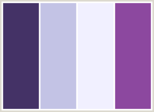
The 2 supporting colors are selected to contrast the main colors. Using your main colors for specific purposes such as bodies of text doesn’t usually look great, so I often choose these two colors to be contrasting shades of black and/or white. An example of this could be the color scheme for this very website. I used Colorcombos.com to generate this color scheme.
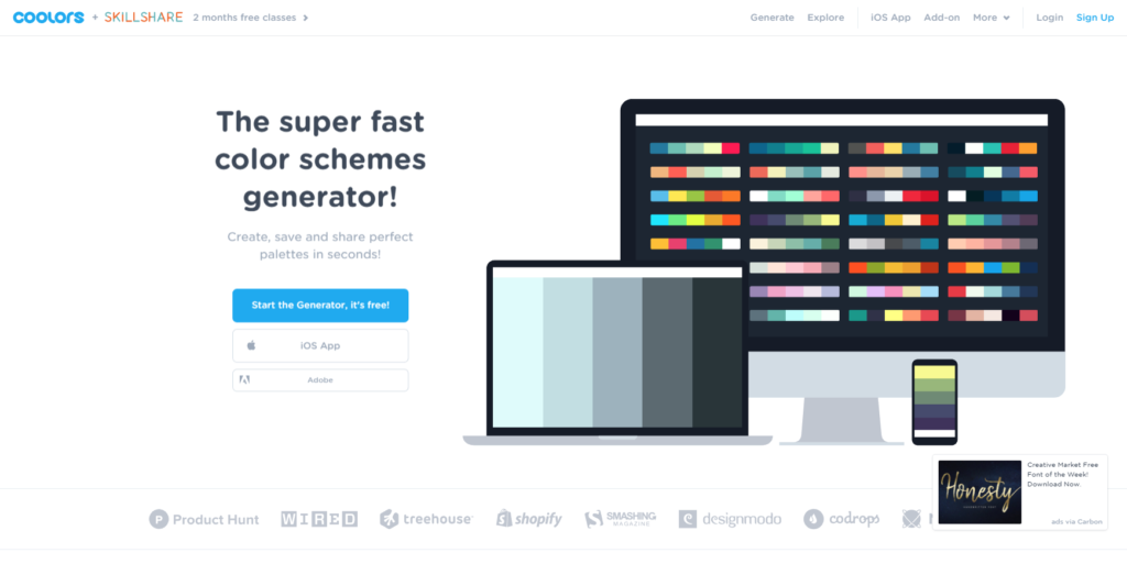
If you aren’t quite sure what looks good together, you can use this free color scheme generator called Coolers. It’s a neat, little tool since you can start off with a color you like and it will instantly generate an entire color scheme for you. Or, if you already have a logo, you can upload an image of it and the generator will give you a color scheme to match. In both scenarios, you’re able to make tweaks or generate a new scheme altogether. Pretty handy!
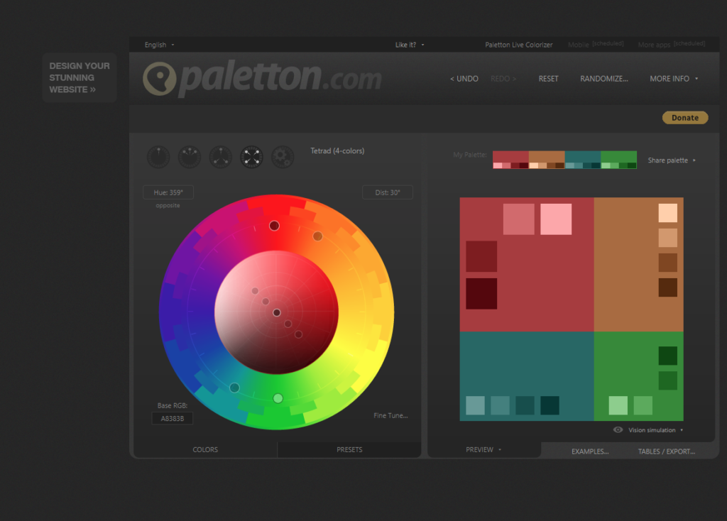
A more in-depth color tool to develop a color scheme is Paletton.com, but I’d recommend this tool for those seasoned designers or artists who are more adept at working with color combinations.
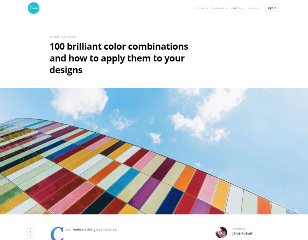
Otherwise, if you have a hard time deciding, or want to get started quickly, Canva has already curated 100 different color combinations for you.
If you want to go for a more modern, flat style scheme (great for UI) check out Flat UI colors on Materialui.co.
> Continue To Brand Design: Typography

- The Amazing Gnome Race - May 14, 2021
- Vieja’s Versus - May 14, 2021
- Toronto Golf Lessons - May 5, 2021